


Understanding complementary colour schemes

It’s true what they say: opposites really do attract. Especially when it comes to complementary colour schemes.
The go-to choice for our Lick decorators, a complementary colour scheme uses hues from opposite sides of the colour wheel. Pick your favourite paint colour and then pair it with its opposite. Not only does this allow you to be more varied with your selection, it creates a look that’s naturally appealing to the eye.
Whether you opt for muted tones or full saturation, a complementary colour scheme is such a success thanks to opposites working together in perfect contrasting harmony.
In this blog, we’re going to whirl our way along the colour wheel and explore which colours are complementary and the different ways in which you can use them together.
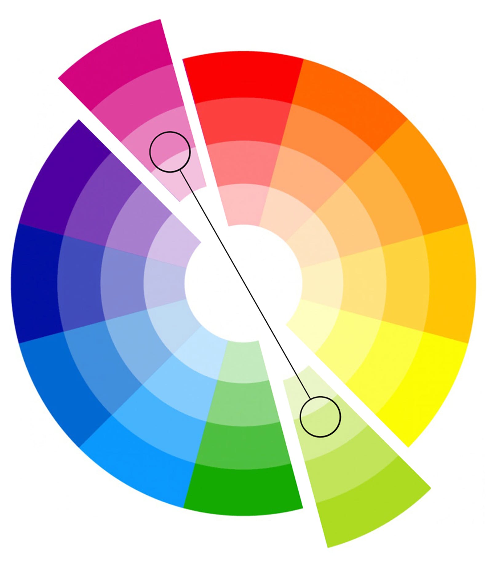
Your basic complementary colour schemes include:
Complementary colours: pink & green
We love this pairing. Try Pink 01 or Pink 03 with Green 05 or Green 07 for a grown-up feminine look. For more of a deep dive into how green works in interiors, read everything you need to know about green paint colours.


Complementary colours: blue & orange
On the gentler side of things, Blue 01 with Orange 02 creates a chic retro feel. Read about our retro colour palette and why these colours ooze 70s glamour. Or, if you want to make a statement, raise the saturation and go for Blue 05 with Orange 01.


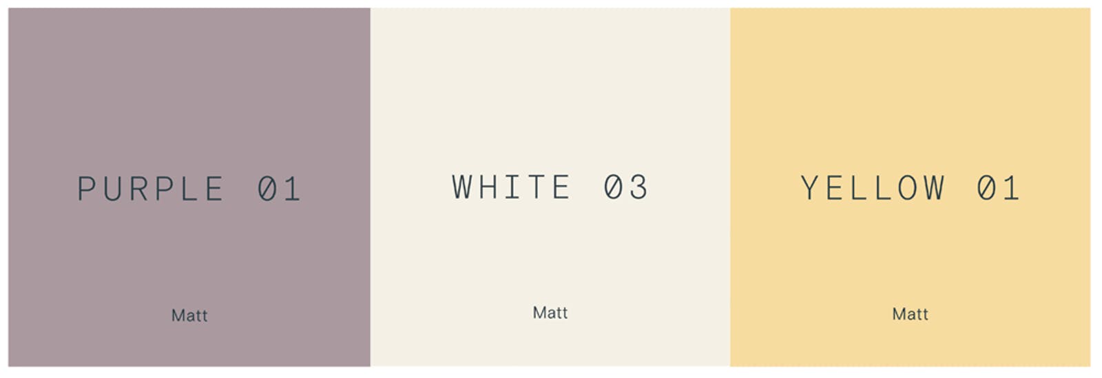
Complementary colours: purple & yellow
It might seem like an odd one, but in more muted tones, this pairing works. Try using Purple 01 with Yellow 01 plus White 03 as something of a mediator, and you’ve got yourself a gorgeous trio.
Complementary colours: red & green
Ok, this colour combo shouts Christmas louder than Brian Blessed in a Santa suit, but opt for a more pastel scheme and you get pink and green. A much more popular and versatile option.
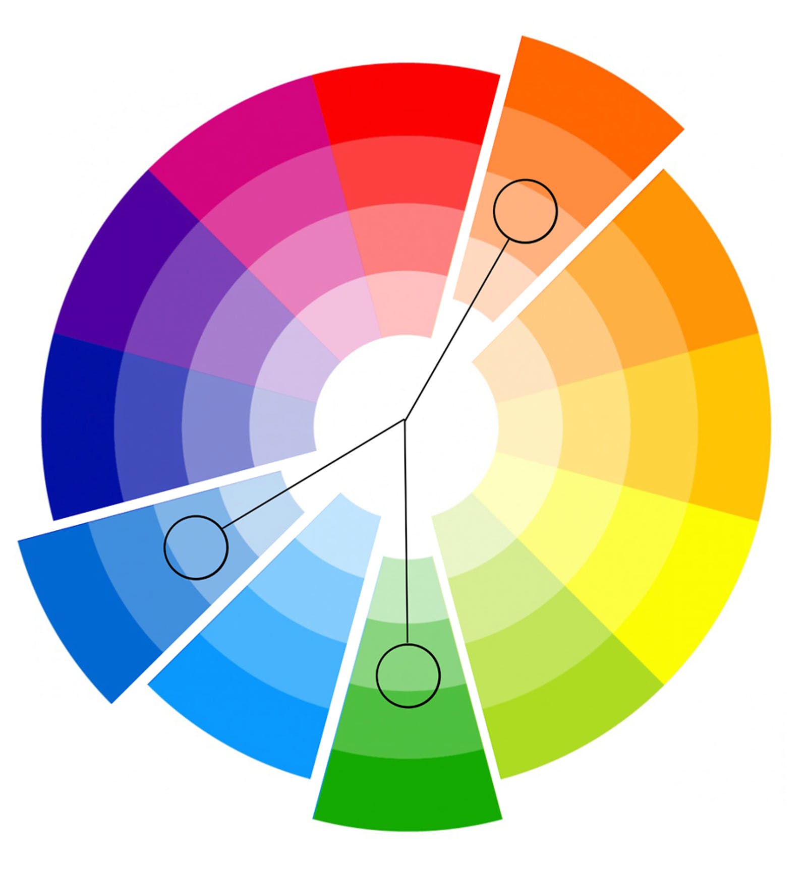
Then there’s what’s known as split complementary. This is a variation of the complementary colour scheme, using two opposing colours (rather than just one). It creates a strong contrast without the risk of colours clashing, which can sometimes occur with pure complementary hues. A couple of split complementary schemes that we love:
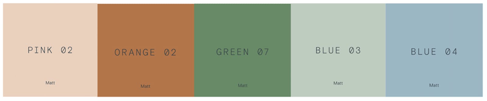
Complementary colours: green, blue & orange
They say that blue and green should never be seen, but by using various tints, tones, and shades of the colour wheel, this combo really works. A mix of Pink 02, Orange 02, Green 07, Blue 03, and Blue 04 creates a timeless vintage vibe that we love.
Complementary colours: green, pink & purple
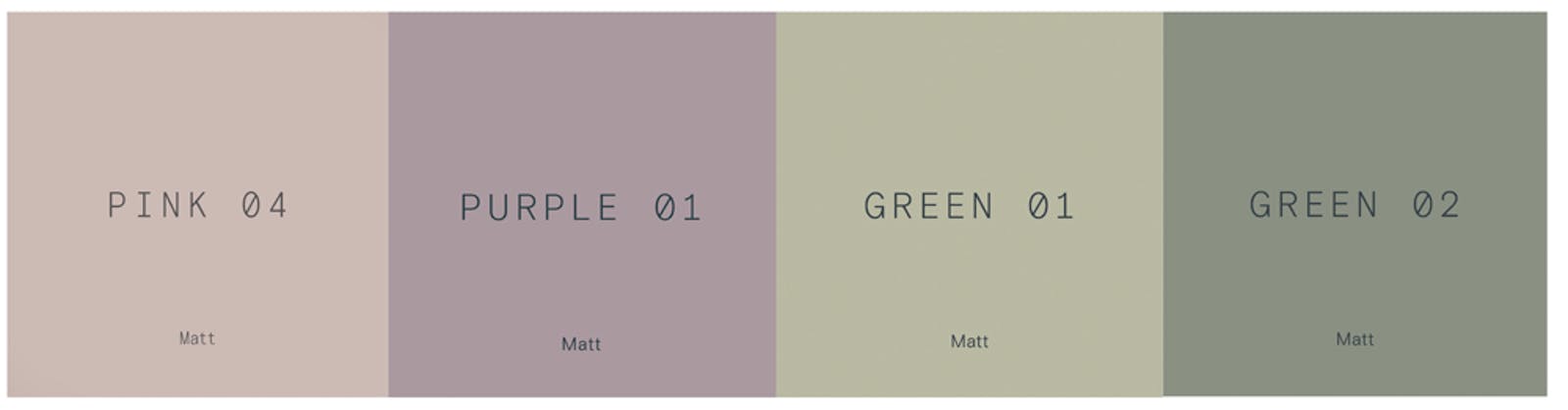
Whilst staying on the softer side of shades and tones, using Pink 04, Purple 01, Green 01, and Green 02 has a soft, feminine feel.
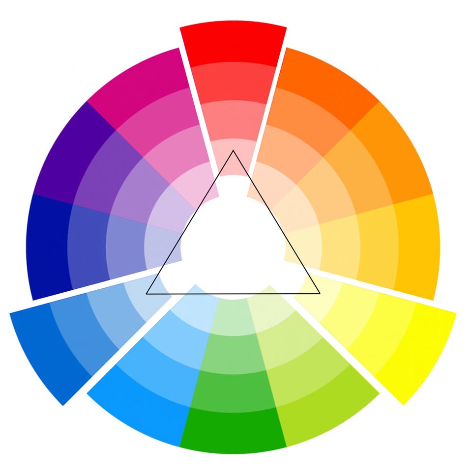
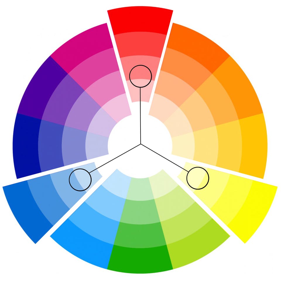
Next up, there’s the triadic colour scheme. This uses three colours that are evenly spaced around the colour wheel. For example, the three primary colours: red, yellow, and blue.
A triadic colour scheme uses every fourth colour, leaving three colours between each. This can be a tricky colour scheme to pull off (you’ve been warned!), but when you do, the results are show-stopping. A few triadic colour schemes to get you started:
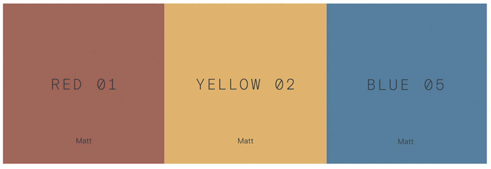
Red, yellow & blue
By using these warm shades of Red 01, Yellow 02, and Blue 05, it creates a nostalgic, retro feel.
Pink, yellow & blue
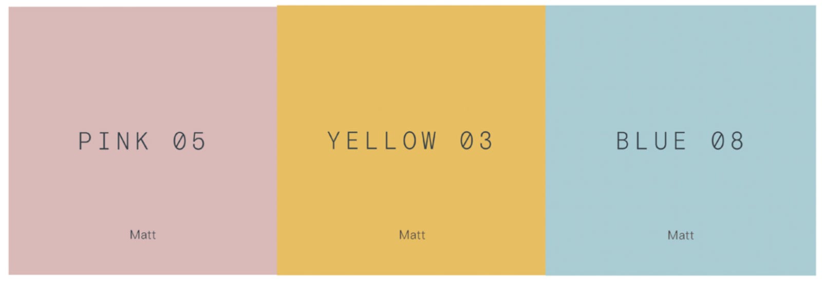
Whilst this modern pastel paint palette of Pink 05, Yellow 03, Blue 08 has all the vibrancy and bon viveur of an art deco interior design. Love pastels? Check out how to style the pastel paint colours from our Palette 01 in your home.
Double complementary (tetradic) colour scheme
Think maximalism with this one. The colour scheme for those who like to apply the go big or go home mantra to their, well, home. A tetradic colour scheme is composed of two sets of complementary colours. It can be in the form of a square or rectangle pairing.
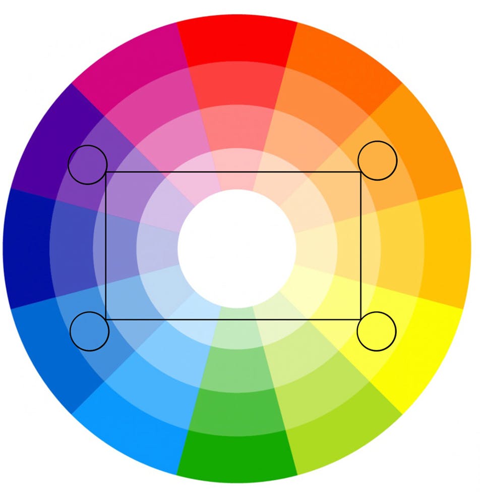
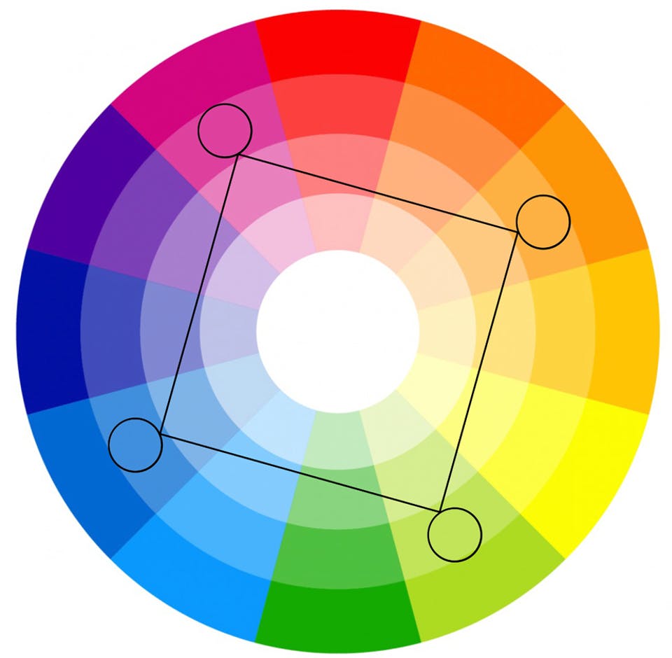
Considered to be the richest pairing as it uses four colours arranged into two complementary colour pairs. It can be hard to harmonise and it requires one colour to dominate or subdue the colours.
If you use all four colours equally, the colour scheme will look unbalanced. Another tricky one to pull off, but when you do, the results are spectacular. If you’re scratching your head about where to begin, here’s some inspiration from our colour experts.
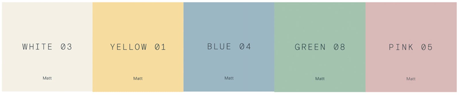
An example of square pairing that we love uses red (in this case, pink) with green, and blue with yellow (or orange). Here’s a palette we created that has a fun and youthful feel:
White 03, Yellow 01, Blue 04, Green 05, Pink 05
An example of a rectangle pairing that works together uses blue or green with purple and red or orange. This palette manages to use a wide range of the colour wheel, yet retain a soothing and natural feel:
Purple 01, Blue 09, Green 08, White 06, Pink 02, Red 03

We hope that’s given you some food for thought and helped you understand complementary colour tones. Not your thing? Perhaps you prefer to keep things simpler with a monochromatic colour scheme or an analogous colour scheme.