


Step into Northcote Road: our flagship Lick store

The word on the street (more specifically Northcote Road) is true. We’ve opened our first-ever store. A place where you can discuss all your design ideas over a coffee with our friendly team of Decorator Consultants, discover your favourite paint colours on our tester wall, or simply gather inspiration for your next decor project. We wanted to make it easier than ever for our community to turn their decor dreams into a reality. So, from the initial creative vision to the execution, interior designer Oskar Kohnen and our Head of Retail, James Cooney, give us a closer look at the design process behind 65 Northcote Road.
Why are we opening a store?
“Our aim was to help customers remove any worries from the process of making big decisions about their home. As convenient as online is, nothing compares to the in-person experience of speaking to an actual human,” James explains. “It was all about creating an interactive experience where people could try out our paints and decorating tools for themselves.” We wanted to make it easier than ever to get real-time advice. Interiors are a tactile business, and with the opening of our flagship store, now you can get up close and personal with all of our products.
The design concept behind Northcote Road
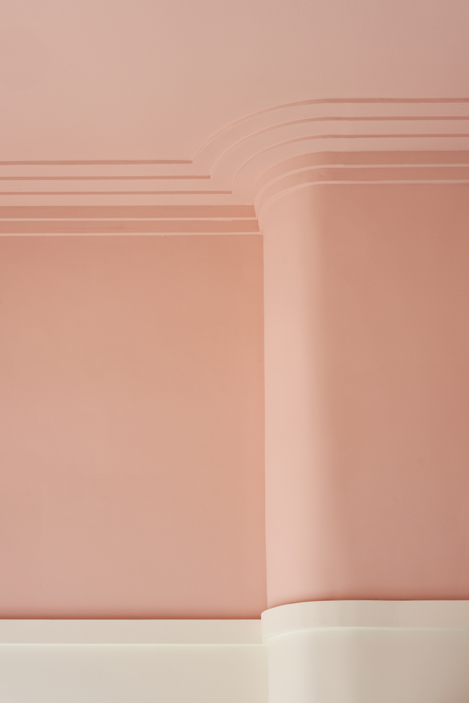
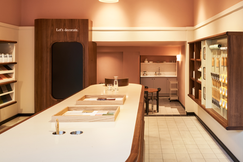
“The main ambition was to celebrate paint as the first introduction to interior design. After all, it’s the most accessible and immediate way to transform your space. We live in a time where interiors are full of marble and precious finishes, and we wanted to do the opposite,” explains Oskar. From the warming colour scheme to the curved architectural features, the store was designed to bring people together and welcome you in with open arms and open doors. The overall look is colourful, sleek, yet very attainable—reflecting the style of the local neighbourhood.
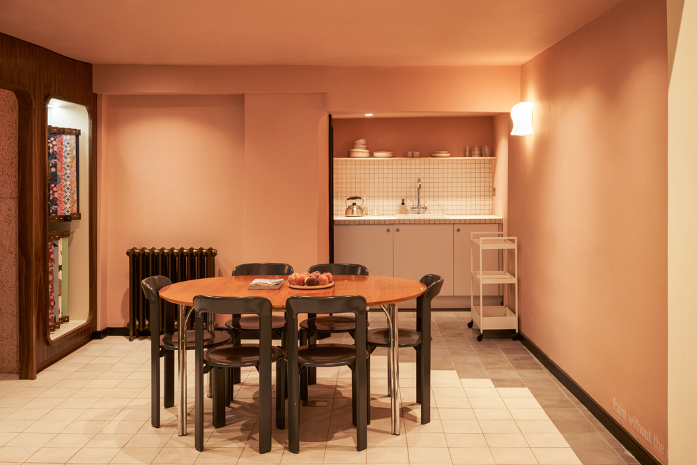
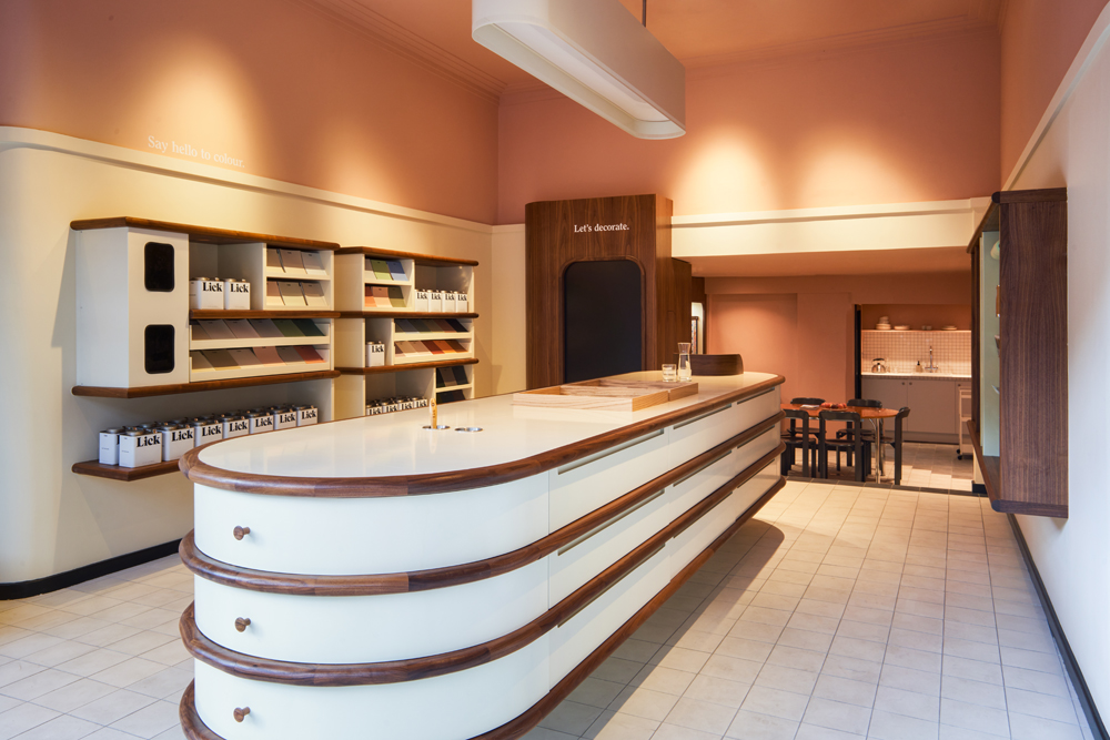
From the warming colour scheme to the curved architectural features, the store was designed to bring people together and welcome you in with open arms.
How did the geographic location of the store influence the interiors?
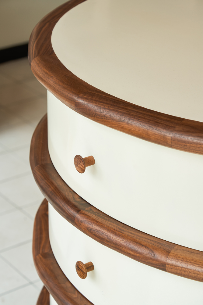
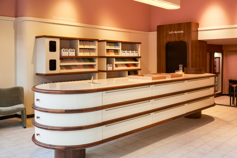
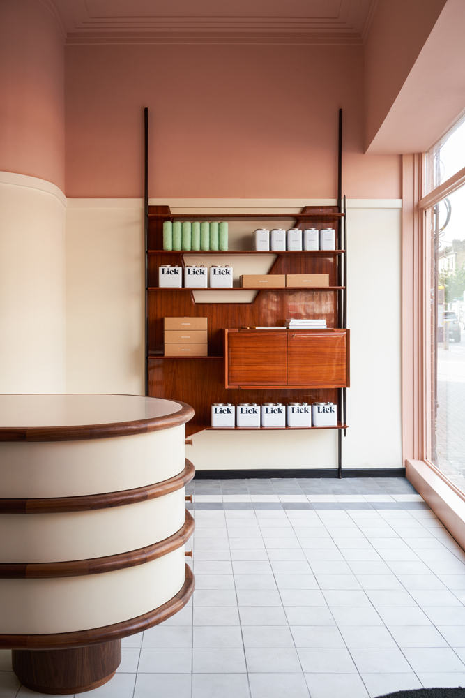
“Northcote Road was definitely an inspiration,” says Oskar. “Looking at old pictures of the high street from the 1950s, every one of those stores used their own simple colour combination to give it an identity. And you still get that feeling today,” he explains. From Battersea Power Station’s pink control centre—part of the inspiration behind the store’s dusky pink Northcote 65 colour—to the curve of the central counter table reflecting the shape of the famous Arding & Hobbs department store, the store’s geographic location is referenced throughout the interiors. There’s a nod to Clapham’s Art Deco architecture with a more modern, Neo Deco-inspired colour palette, whilst the furnishings are influenced by a forward-looking, post-war, mid-century aesthetic.
What thought process went into the layout of the store?
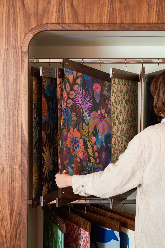
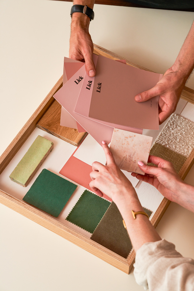
This is where James and Oskar’s eye for design really came together. Oskar’s vision was to “create a place for people to get inspired. A workshop-meets-studio feeling, making the store somewhere you could not only pick your paint colours but also try them out and get creative”. The solution was a wall-to-wall sample display, where customers could come in and select their colours, lay them out next to one another and create their own colour palette and the beginnings of a mood board.
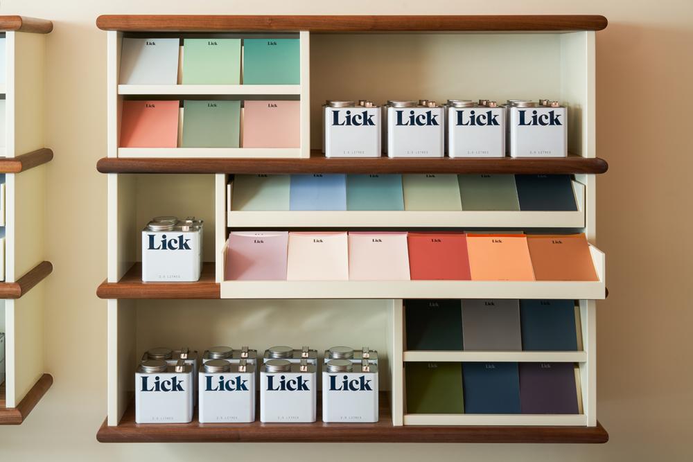
Next, there’s a chance to roll up their sleeves, get creative, and try out the paints (as well as our tools) on our tester wall.
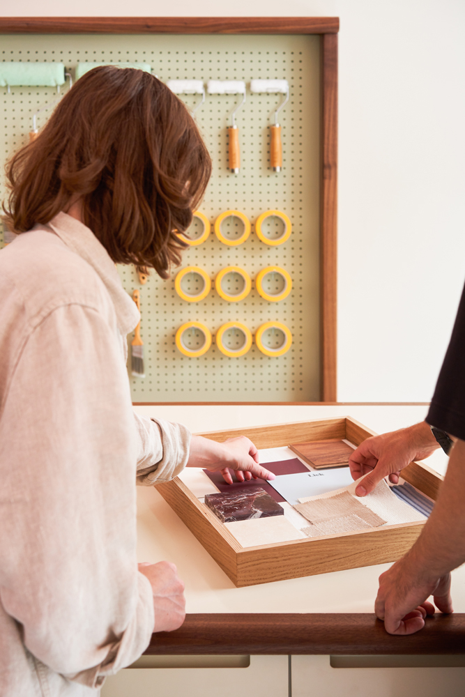
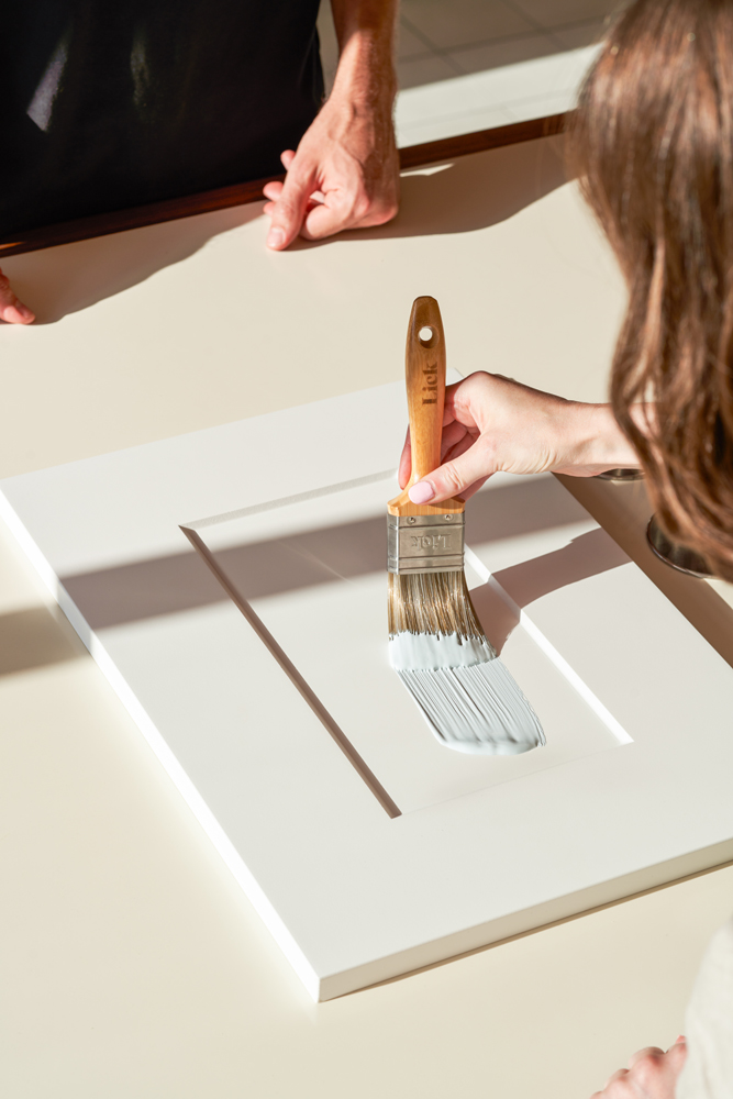
James echoes this sentiment, “we designed the store to be a playful space that felt more like a home than a shop. When you come in, someone offers you a cup of tea. You can sit down and talk about your decor plans with one of our team,” he explains. “We didn’t want there to be a closed off back of house area—that’s why there’s a big communal table where staff and customers can all congregate and communicate whilst creating a sense of activity”. The result is an open-plan, interactive space with a welcoming and friendly feel.
We designed the store to be a playful space that felt more like a home than a shop.
James Cooney, Lick Head of Retail
What considerations went into creating a colour scheme for the store?
“When you walk along Northcote Road, you notice that all of the shopfronts are painted in unique and bright colours. We wanted the store’s colour palette to feel really individual,” says James. Created around the bespoke Northcote 65 pink paint colour, the store’s interior colour scheme is playful without being overpowering.
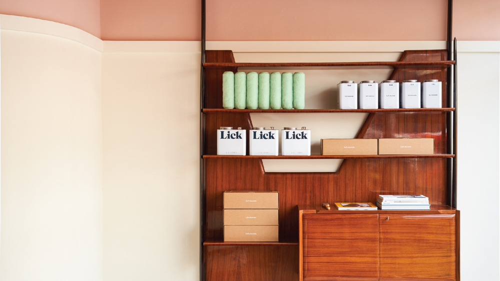
Combined with White 05 for the lower part of the walls—the perfect neutral for trying out paints on our tester walls—alongside black skirting and a light grey cement tile, it creates a perfect contrast and gives the store that atelier feel. “The combination of pink and black draws from that updated Art Deco inspiration once again,” Oskar explains. “This, paired with Green 01 accents and light walnut furniture, creates that Neo Deco feel, without it looking too bubblegum”. In all, the colour palette for the store feels light, energising, and very inviting.
Our Northcote Road Lick colour palette
How does Lick’s commitment to sustainability translate throughout the store?
"From the get-go, we tried to be as sympathetic to the building's original structure as possible," explains James, "everything we've built, from the shelving to the display units, has been built to last".
Everything we've built has been built to last.
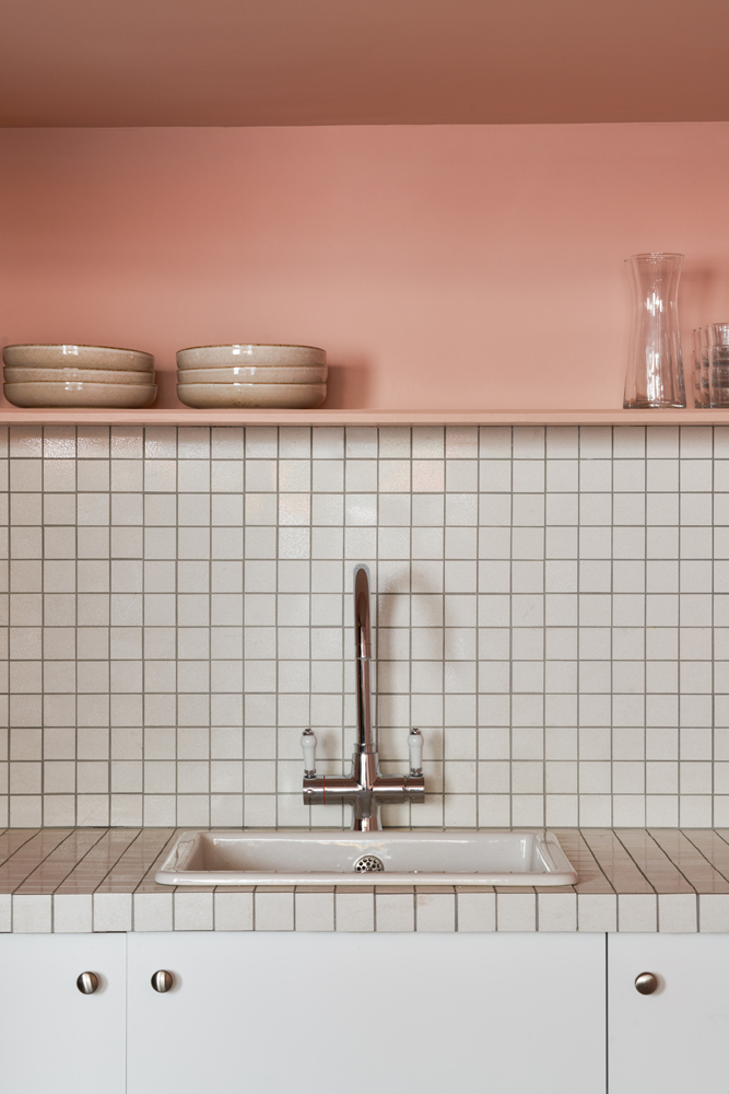
When it came to furnishing the store, we opted for high-quality and vintage pieces, with some items sourced from local antique markets. And it goes without saying that all of the walls and the shop's exterior were painted with our low-VOC, water-based paints. In the kitchen, we've even opted for a Verana boiling water tap as an eco-friendly and energy-efficient alternative to boiling the kettle. Because all those cups of tea add up!
Feeling inspired? Why not pop down to our flagship 65 Northcote Road store for a cuppa and the answers to all your decor questions.
Location: 65 Northcote Road, London, SW11 1NP