


How to recreate the Bridgerton colour palettes in your home interior decor

All images credited to Netflix
As one of the most hyped-up TV shows of 2021, Bridgerton had everyone feeling inspired. Set in the Regency era, the show encompassed hyper-realism with an artistic license that exaggerated colour and drew in the modern audience, filling the TV frame with pure delight.
The Bridgerton team produced a stunning array of vibrant sets and cherry-picked the perfect locations. With season 2 on the horizon and the anticipation of more drama, romance and charming colour palettes, we share our thoughts on the colour theory and psychology behind the sets, and how you can incorporate these eye-catching palettes into your own home decor.
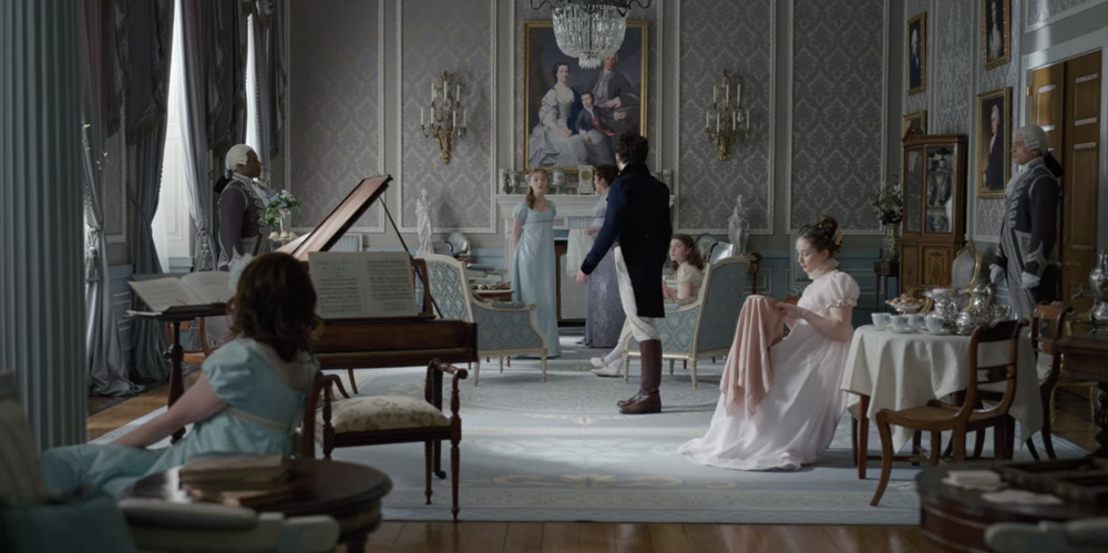
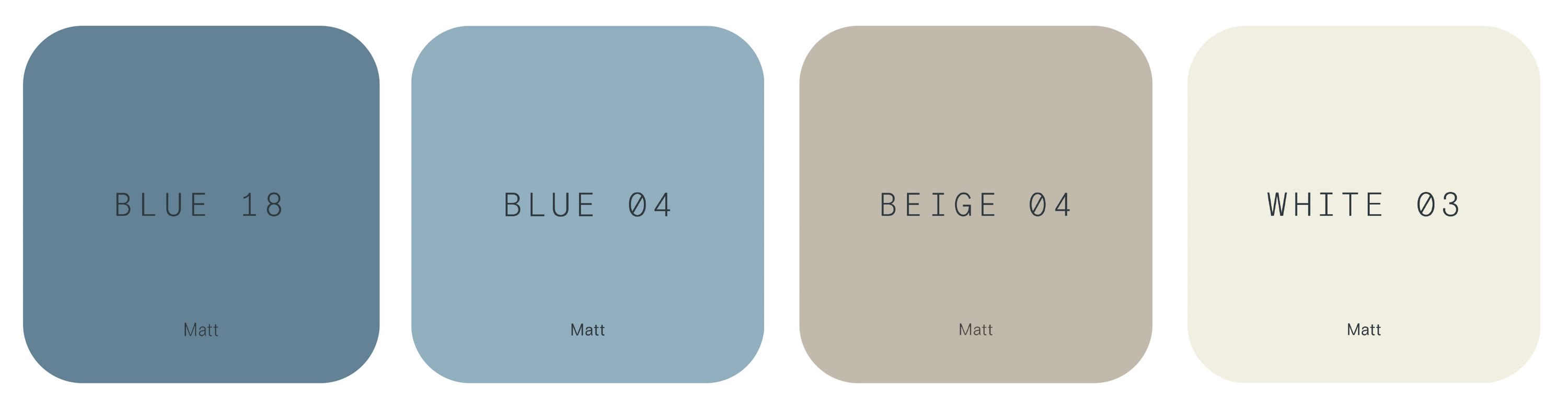
The Bridgerton’s drawing room is where many of the iconic scenes are set. The Bridgerton women often gather here to discuss their latest endeavours, the men that caught their eye and speculations on who Lady Whistledown could be.
Monochrome is very much the popular colour harmony within the framework of the drawing room's interior; using delicate pastel tones of blue that simultaneously add calm and strength to establish the Bridgerton’s presence in society. During the Recency era, blue was also considered a feminine colour. Muted accent colours are woven seamlessly into the palette, with soft pinks signifying a nurturing presence, and purples representing their regal status.
When it comes to the wallpaper used in the room, a damask design is framed within wallpaper panels. What goes around comes around, and we are already seeing the revival of wallpaper in panels.
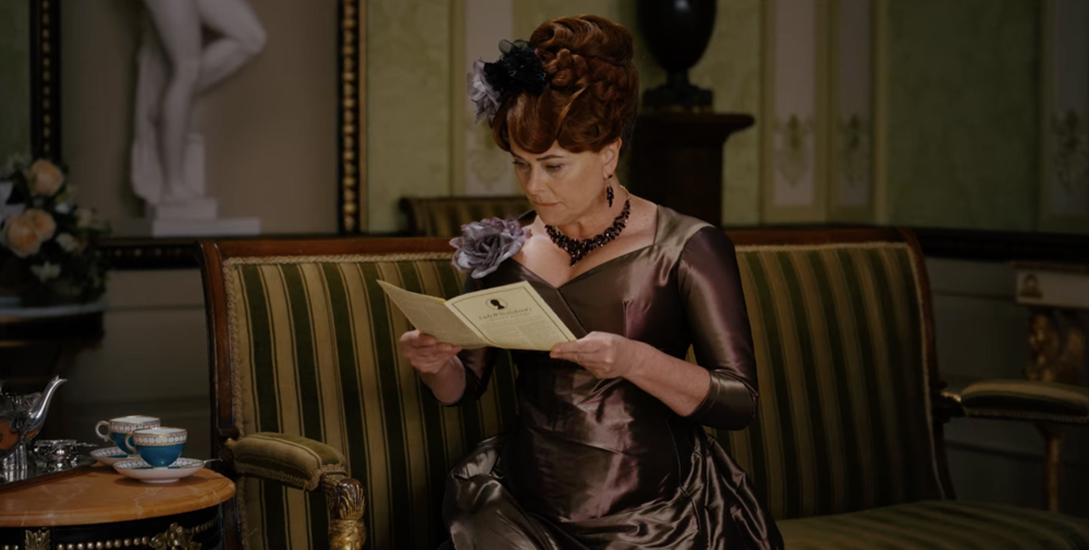

The Featherington residence offers the same bold and flamboyant presence as the family which inhabit it. Their maximalist style home is all about standing out from the crowd and garnering attention, much like their outfits too.
Although the Featheringtons head into season 2 with money problems due to Lord Featherington’s gambling, they are considered a new money family. With no ancestral background to adorn the walls, portraits and inherited furniture, they have characterised the space with ornate plasterwork to display opulence and shiny new high society accessories. You can see this in the finishing details of shiny materials, gold and highly varnished furniture.
Colour is represented in a positive form for the Bridgertons, but the Feathertons colours take on the negative connotations. Green is used a lot for envy, and in the wrong hue can be emotionally draining. And using yellow is about value, wealth and is symbolic of worship and winning.
Typically, interior designs take inspiration from the colour wheel, and this palette is no exception and harmonies with the analogous colour theory, with greens, yellows, and oranges sitting proudly together.
While viewing this colour palette together can seem overwhelming - and it certainly feels unapproachable to place all these colours in a modern home, especially in one room - if you want to incorporate this into your own space, I’d suggest building the colour around many elements. The green can be represented in greenery, orange can be within your furniture/wood tones, and pink could be your accent against the serene White 03 coloured walls.
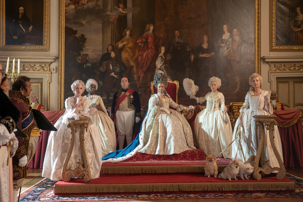
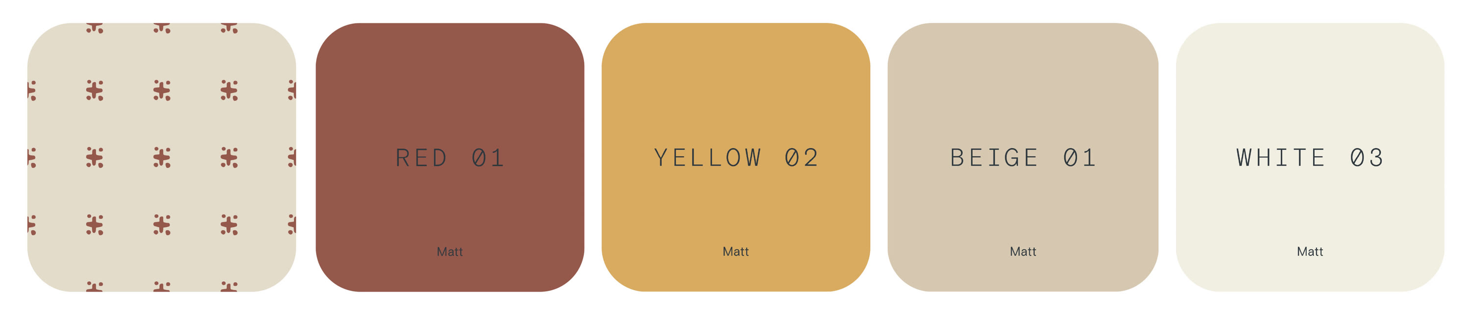
The controversial Queen Charlotte boasts power, confidence and a larger than life personality. With her flamboyant costumes and monumental wigs filling the frame, the queen demands attention in every setting. But, the palace is where she truly belongs. To create the bigger picture, the sets and locations are complementary and guide the character through beautiful stately rooms, tying everything together with a huge gorgeous red bow.
Yellow and gold are used throughout the palace, with yellow being an emotionally stimulating and optimistic colour and gold being long associated with wealth and worship. Within the palace walls and on the walls the abundance of gilded gold is on everything to establish power and the abundance of money. Using the right amount of yellow is key to bringing the correct balance, as too much can be irritable and depressive.
Red is used frequently in the carpet, drapes, upholstery and chairs, which is all about attracting attention as the most visible colour in the spectrum. You may also notice white and cream used primarily on the walls, these colours have always been associated with the rich because of the upkeep of purity and cleanliness.
Everything is loud and big in the Queen’s rooms, and the artwork is no exception. When it comes to choosing pieces for your home, I’d suggest going large with art, filling your walls with beautiful squares that make you smile and make you stop and wonder.
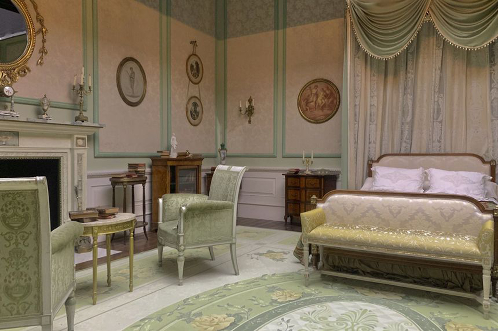
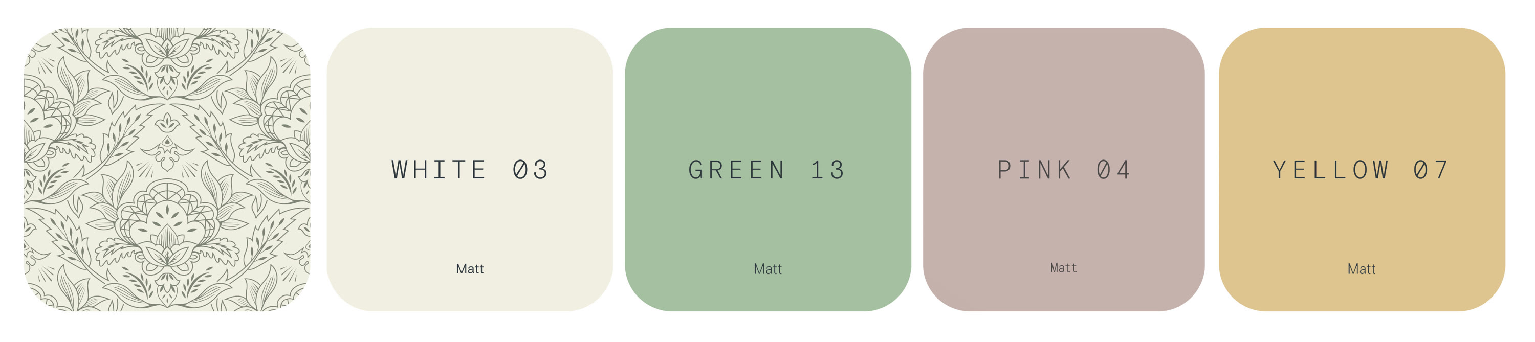
At the end of the first season, it was revealed that Lady Whistledown was none other than Penelope, so her office doubles up as her bedroom too. It’s no secret that Penelope is always dressed in the fashionable colour of the decade, yellow. This colour is chosen on her behalf to stand out with the debutante community. As the colour palette within her costumes is of the citrus variety, it's nice to see that they have calmed the hues down in her bedroom set. Most likely to represent a more gentle nature of the character.
Pink and green feature heavily which, as complementary colours on the colour wheel, make them naturally appealing to the eye. The room is then accented with yellow to lift the design. Yellow can be known for having negative connotations, representing deceit and jealousy, which is quite fitting and coincides with Penelope’s storyline.
Patterns are also a big part of Penelope’s room and will likely be a huge decorating trend. The success of pulling this off is to keep threading the same colourways throughout the scheme, and you can have as much or as little pattern as you want.
The focal point and framing of the bed is another trend growing in popularity, and Penelope’s bed demonstrates this beautifully. Consider large headboards, drapes (we think you should hold out on the swags for the moment) and then there's paint - colour blocking and adding an accent wall behind your bed is very now.
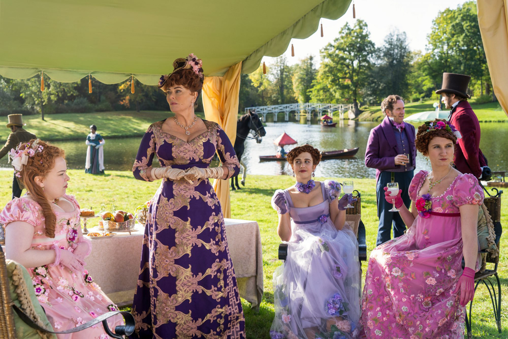
From balls to garden parties, hosting or attending grand events are all part of the Regency era experience. The last garden party luncheon thrown by Queen Charlotte saw plenty of drama as she bet on Simon and Daphne producing an heir and questioned Eloise on the identity of Lady Whistledown.
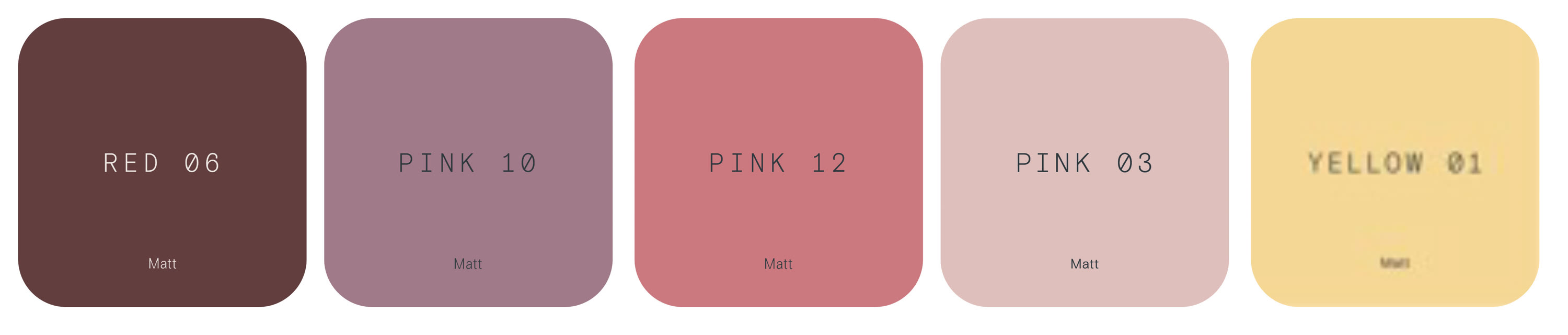
In the season 2 promo pictures, we’re treated to a shot of another upcoming garden party that’s filled with reds and pinks. These colours are most often associated with love, tenderness and passion and, interestingly, the Featherington women all appear to be wearing varying shades of red and pink. Could this mean that romance is in the air? Let’s hope so!
Soft yellows are also featured in the garden party decor with yellow drapes and blankets, which provides us with refreshing splashes of optimism that this would be a happy occasion.
Season 2 will no doubt treat us to even more vibrant colour palettes, feature patterns, and interior decor to complement the new storyline and characters. With such a huge following, this show will undoubtedly inspire many home interior enthusiasts to add a splash of colour to their homes.